
Serif Font Round Up
Lately I’ve been enjoying all the beautiful serif fonts that are really taking center stage in the design world. I typically lean more sans-serif, but have really come around to adding in serifs, even to my own mini-refresh. There’s just something about their editorial, refined and high-quality feel to them. And better yet, I love mixing both sans-serif and serif together to craft a complimentary typography system that helps stand the test of time.
A quick reminder on what a true serif font is. Serif fonts have a decorative stroke that finishes off the end of a letters stem.
This post rounds up 6 of my current favorites. From a traditional approach to more editorial driven, I’ve had my eye on a few of these and will hopefully use them in future projects down the line.
One.
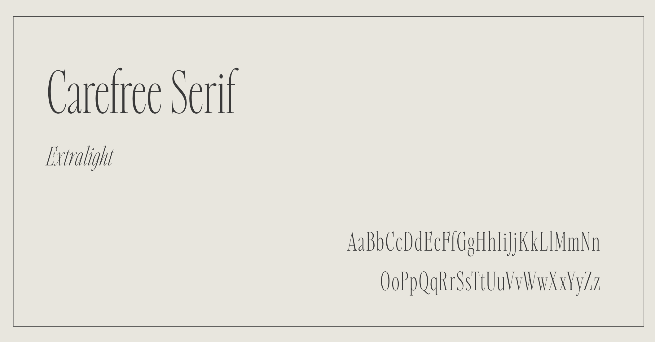
Carefree Serif
This font had me at magazine inspired. The typography designer, Jen Wagner, makes the most stunning fonts, and this one is a top favorite at the moment. It was even used on a recent website launch for a San Diego wedding photographer’s site. See it in action right here.
Get the font here.
two.
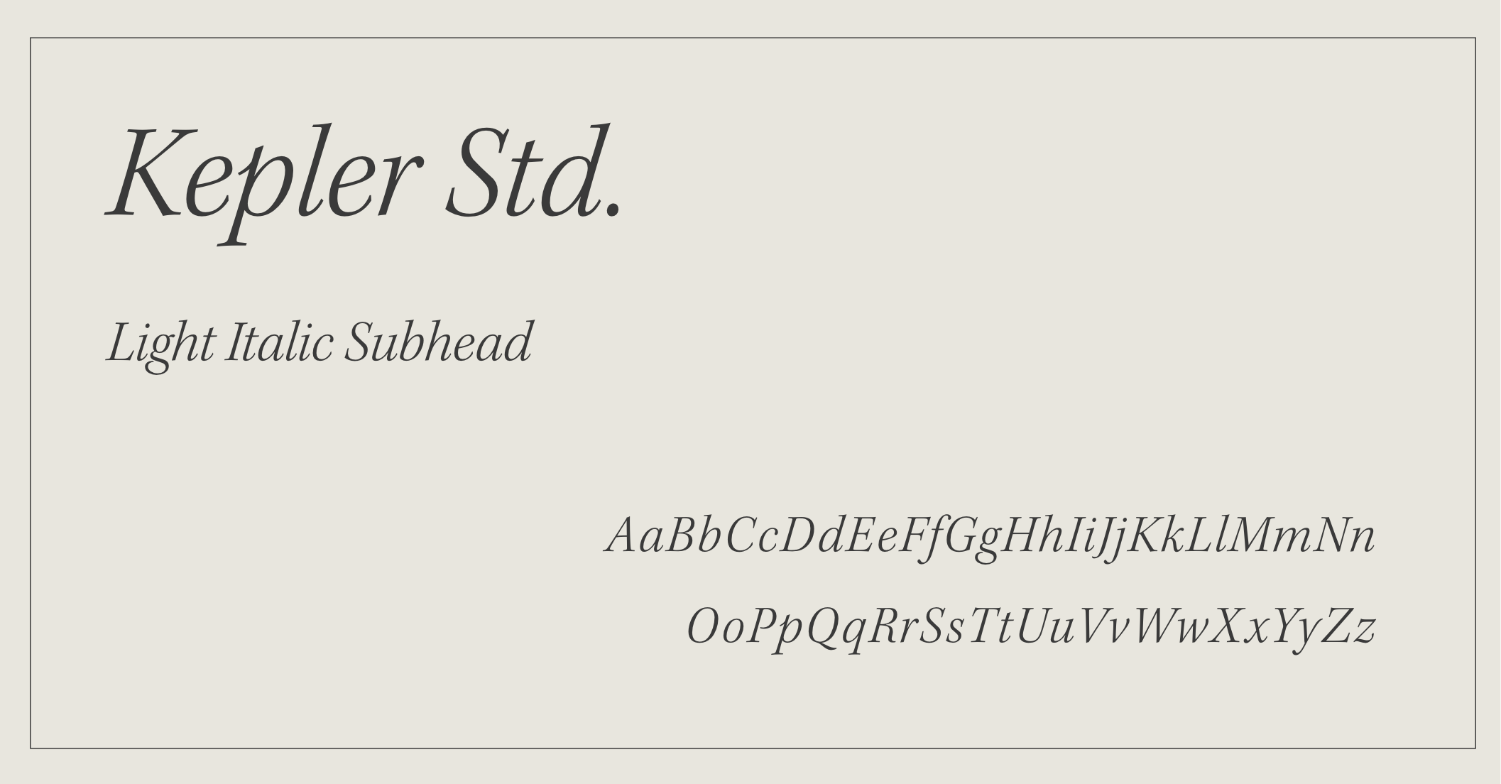
Kepler
Kepler leans a bit more traditional, but still is unique enough to make an impact. Not to mention there are many font weights to explore, and the italicized versions of this font are so dreamy. Too many varieties to choose from, but Kepler Std Light Italic Subhead is a favorite!
Get the font here.
three.
IvyOra
During my research on this blog post, I (happily) stumbled across IvyOra. I immediately added this to my Adobe font line up, as I feel it could easily sway very editorial or even go more minimal–depending on what fonts it’s paired with or how it’s used. A versatile serif font is always a win in my books!
Get the font here.

four.
Trirong
For this round up, I wanted to make sure to include a Google font, as they are free to download and can be a great option for brands just starting out or needing to have an option that’s “worry-free” in their font line up. Trirong falls under the radar of popularity, which I love, as it still feels bespoke and curated. It looks beautiful set with all caps as well.
Get the font here.

five.
Canela
Canela is undoubtedly having a moment right now, but it’s just so beautiful not to share. Depending on the weight, it can feel very graceful, bespoke and even confident. I envision Canela for a luxury florist, bespoke wine bar or even a creative studio.
Get the font here.

six.
Meno Display
For a super classic, timeless serif font, I love Meno Display. It has a slew of weights, beautiful italicized versions and is very legible. It would be perfect for subheadings, as it’s very detailed and can give off the impression of sleek, refined and timeless all at once.
Get the font here.

And if you’re loving posts like these, I have an entire curated board on Pinterest dedicated to typography. Give it a follow here.
Ready to build a custom brand identity for your creative business?