

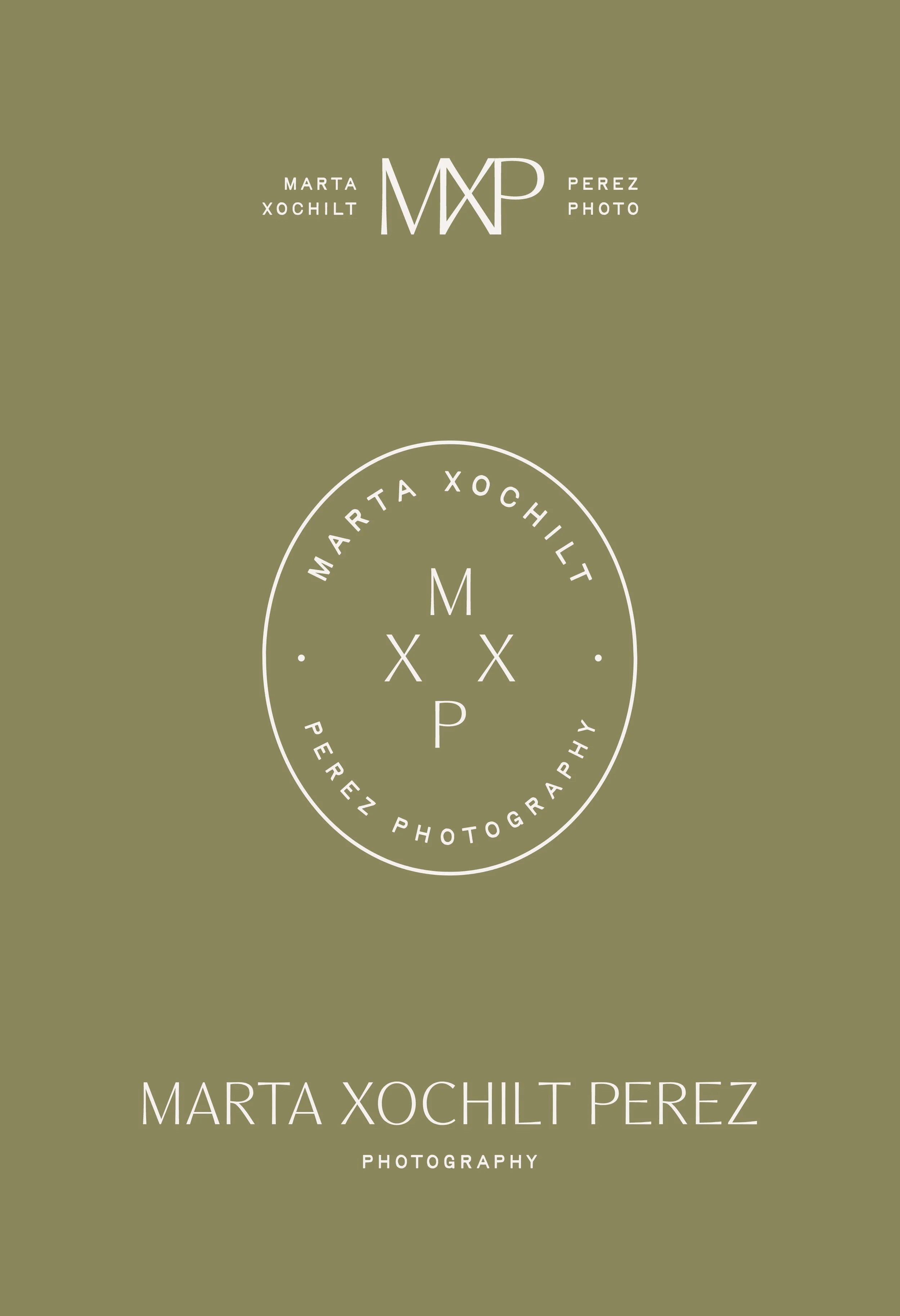
Marta Xochilt Perez
Editorial meets minimal brand identity for this story driven photographer specializing in interiors.
Known for her timeless, minimal and authentic photography style, we worked to effortlessly weave these elements into Marta’s rebrand. Her logo suite evokes a sense of relaxed effortlessness with a touch of modern contemporary. The color palette was inspired by natural textures and earth tones prevalent in Marta's work. The brand itself now gives off a laid back, refined, and relaxed energy.
Design notes:
relaxed
elevated
minimal


Services Provided
Brand Identity
collateral design


A Bit More About the Project
Industry: photography
Location: detroit, mi
PROJECT COMPLETED: 2025
Photography: Marta Xochilt Perez


Final notes on the branding for this lifestyle photographer
What set out to be a small brand refinement for this top interior design photographer unfolded into a more in-depth branding exercise. With wanting to feel both elevated and relaxed we went with a mix of fonts to build out her typography driven logo that evoked both imperfection and timelessness.
We played with a variety of traditional style logo variations for the rebrand, while also brought in a few alternative layouts that feel modern, polished and slightly unexpected. To bring in that lived-in, authentic feel, we created a series of brand badges that felt relaxed and help add another layer to the branding.
For the brand marks, we leaned editorial and refined. Offering a mix of enclosed style and monogram to be utilized in a variety of ways, all to enhance the brand experience.